 Visualization is a huge factor in audience comprehension of your presented material. Whether online or off, you all like images. When it comes to digesting huge amounts of information, you turn to the trusty pie chart. Easy to comprehend and colorful! But in this day and age, there is something even better than pie charts. Sankey diagrams are now the way to go. What are they you ask? Let me explain.
Google Analytics and Sankey
Just this month, Google released to the general public the Sankey diagram within your Google analytics accounts. It’s a visitor flow diagram encompassing every visitor, every country and every behavior of your website visitors. Imperative information to have. Once you determine your visitors actions on your site, or thereafter, you can tweak and test to your heart’s desire. The benefit of the diagram it is almost an engineers blueprint of your site. Schematics and such for you to monitor any metric you can dream up. Check out the pic below to see what I mean.
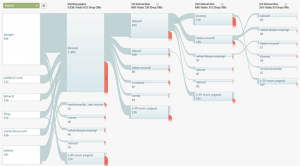
Understandably you may not be able to see the details in this diagram, but hopefully you get the point. From the initial click to your site all the way to the exit; the flow of your visitors is shown in graph form. So why should you care?
Why Sankey is Better
The idea that you can visualize energy, flow and so many different processes is simply stellar. A Sankey diagram dominates a pie chart on so many levels. Drilled down information and flow processes could never be seen using a pie chart. As they may look overly complicated, you should know there is always a way to simplify. Sankey software is available for you to create your diagrams and metrics.
If you are wondering where these came from, here is what Google has to say:
Many of us draw our inspiration from Charles Minnard’s 1869 work, epitomized by his diagram of Napolean’s March to Russia. Edward Tufte, who is well-known for his popular visualization books, calls Minnard’s work as “… probably the best statistical graphic ever drawn.”
These diagrams or process charts can help you measure costs, traffic, social engagement; whatever you decide. It would be beneficial to check it out. If you want to see more sankey diagrams, there are over 170 you can see here.
For some great examples of these diagrams and what they can measure, here are some links for you to consider visiting. After visiting these links, make sure you head back to your Google analytics account and review your visitor flow sankey.
- Network flow – structural changes via alluvial diagrams
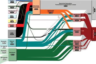
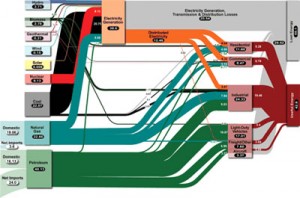
- Flow of Energy – energy management and power plant efficiency
- Flow of Traffic – transport analysis and tournament analysis (ex. 2010 FIFA World Cup!)
- Flow of Wealth – money flow, social conditions, and stock price modeling


I use alerts to get new, relevant, high pr backlinks for my websites. It really is a fantastic tool!